You smell gas. Now what?
A regulator's website with all the right answers and no clear way to reach them.
We fixed the pressure, not the pipes.
COMPANY: Commission for Regulation of Utilities (CRU)
CATEGORY: Public Sector, UX, Information Architecture
MY ROLE: UX Researcher
TEAM :
Turning a regulator's safety pages from something to read into something to do
The information was already correct. It just wasn't reaching anyone. I led the research that reframed the brief from a content problem to an action problem.
Context
CRU sets gas and electrical safety rules in Ireland. The public-facing pages were accurate and complete, but written as documents, information stood in for authority rather than helping anyone act on it.
Challenges
Four teams, four definitions of the problem
Accuracy and usability pulling against each other
LPG and natural gas covered unevenly
Legacy "Read more" ending every page, nowhere
Solution
.Rebuilt the Information Architecture around where you are, replaced every "Read more" with a named action, and put a persistent emergency bar that handles the LPG split in-component.
Goals
More answers, not more content
Structure around the questions people arrive with
Every page ends in a next step
Hold regulatory accuracy throughout
Outcomes
Four teams aligned on one problem statement before anything was drawn
Mid-fidelity screens signed off; open questions annotated on the artefact
A live content error caught before launch
Taming the clutter: giving Women in Economics a homepage that guides
The Women in Economics (WiE) Initiative's site had grown by accretion, five volunteer teams each adding content on request, with no shared structure. A first-time visitor landed on a single podcast episode before learning what WiE even was. I restructured the homepage around a clear hierarchy and introduced the design system the site never had.
Phase 1 : Research
Understanding the site and who feeds it
I began by auditing the live homepage and tracing how content actually gets onto it. The site has information that is fed by five teams: mentorship, board, podcast, media, and HR - each adding pages and posts on request. That explained the sprawl: five independent content sources, no shared owner of the homepage.
I also looked outward at how comparable non-profits and initiatives present themselves, and mapped WiE's real assets- the annual mentorship program, the podcast, events, and newsletter- against how visible each currently was. The pattern was clear: the strongest asset (mentorship) was among the least findable, while a single podcast episode dominated the top of the page.
Homepage audit
Traced what a first-time visitor actually meets, in what order.
The Problem
The constraint that shaped everything
Team mapping
Identified five content sources with no shared structure.
Peer benchmarking
Compared how similar orgs guide newcomers to action.
Not too little content. No hierarchy.
WiE is a volunteer-run non-profit advancing gender equality in economics. Its site carried real value — a podcast, an annual mentorship program, events, a newsletter. But everything arrived with the same visual weight. Content flowed in from five teams (mentorship, board, podcast, media, HR), each requesting pages as they needed them, and nothing decided what the homepage was actually for.
Four audiences, all "top priority"
When I asked the team who the homepage should serve first, the answer was everyone: newcomers, mentorship applicants, the podcast audience, and partners. All four mattered, and all four wanted the same headline space. That tension was the clutter.
Sequence, don't sacrifice…..
Rather than pick one audience and drop the rest, I sequenced them. The newcomer path leads because newcomers become the mentees, listeners, and members downstream, and the other three sit as clear, equal secondary routes. Hierarchy, not subtraction, is what removes the clutter.
Four audiences, all "top priority"
When I asked the team who the homepage should serve first, the answer was everyone: newcomers, mentorship applicants, the podcast audience, and partners. All four mattered, and all four wanted the same headline space. That tension was the clutter.
Phase 03 · Design system
Who are we? : A design language Wie could share
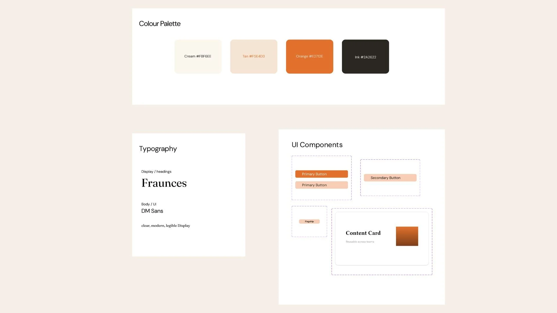
The site had no shared identity - styling drifted page to page because each team improvised. I introduced a warm, welcoming palette led by orange as the single action colour, a Fraunces + DM Sans type pairing, and a set of reusable components. Now any team can add content by pulling the right block, and the homepage stays coherent no matter who's contributing.
A homepage that guides, not overwhelms
Reflection
Three things this project taught me about designing for a regulator
The hardest part wasn't visual. It was saying no to "everything first" without dropping anyone.
Reframing the brief from which audience wins to what order serves them all unlocked the whole design. If I took this further, I'd validate the newcomer-first sequence with a quick tree test and first-click study, and pull the real inner pages to build exact before/after pairs.