You smell gas. Now what?
PROBLEM
A regulator's safety site that was right about everything and useful for nothing.
SOLUTION
Rebuilt around what people need to do, not what CRU needs to publish, in turn will aim to increase traffic 3 times
COMPANY: Commission for Regulation of Utilities (CRU)
CATEGORY: Public Sector, Energy, Information Architecture
MY ROLE: UX Researcher and Service Designer
How did I build energy safety advice around action?
Energy Safety Awareness campaigns for the Commission for Regulation of Utilities were landing. Behaviour wasn't following. I redesigned the Energy Safety experience around the moment someone decides to do something, not the moment they read about it.
We fixed the pressure, not the pipes
The information was already correct. It just wasn't reaching anyone. I led the research that reframed the brief from a content problem to an action problem.
Problem
CRU's safety pages were accurate, complete, and got nobody to do anything.
Solution
Redesign the information structure used by about 1 million people in Ireland so they act.
Goal
Give people more answers, not more content.
Challenge
Four teams, four versions of the problem, and a site that ended every page with "Read more."
Impact
Safety guidance that participates in CRU's mandate instead of documenting it.
What did the research indicate ?
My hypothesis
People already know gas and electricity are dangerous. What they lack is a clear, specific next step- one small, obvious action to take immediately- so good intentions fade before they become behaviour. As a result, awareness gaps persist, and safety incidents have increased.
What I did
Synthesised three sources: site analytics maintained by the web team, performance data from the public awareness campaigns, and an opinion survey of internal and external stakeholders.
THE STARTING POINT
What did the audit actually find?
I audited the current pages across the existing site. The content was correct, and the structure followed CRU's internal shape, fuel type, scheme, and legislation. Nothing was written for the person standing in the situation.
No next step
Nearly every path ended in "Read more", a link to a longer page rather than a thing to do.
Key problems identified
1
Invisible regulator
The public didn't know CRU existed. The pages didn't surface where people search for safety guidance; other bodies' sites did.
2
Technical, not useful
Content discharged an obligation rather than answering a question and was split by fuel type, which no user thinks in.
3
What I learned
Campaigns delivered reach and recall, but the matching lift in on-site actions never followed. Attention was arriving; it wasn't converting.
How I focused on the solution
I stopped treating it as a content problem. The design target became the step after awareness, and signposting to the body that owns the action.
"Our website never comes across when the public looks for safety information. Other regulated bodies sites do” - Internal CRU Stakeholder
"The site needs to be redesigned to actually cover the safety topics people ask about."- Recurring theme in stakeholder survey
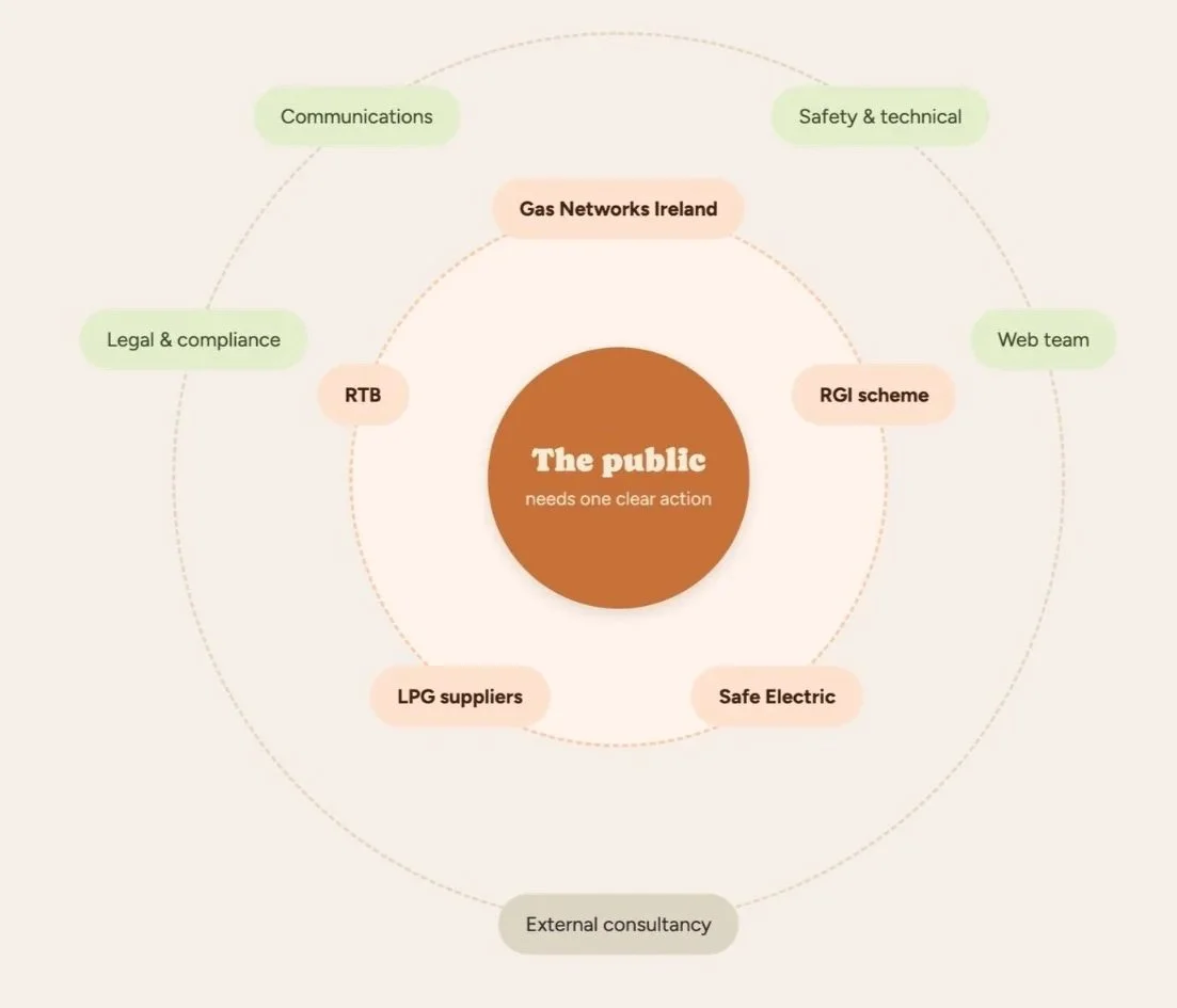
Mapping who owns the Action
CRU is rarely the last stop. Mapping it out made the design problem obvious: the public sits at the centre needing an action, the bodies who can perform that action sit one ring out, and the CRU teams decide what the public sees sit further out still, furthest from the person they're writing for.
The insight
CRU doesn't need to own the action. It needs to be the trusted middle, help someone recognise their situation and obligations, then hand them cleanly to the ring that can act. That reframed "content refresh" into "signposting design."
COMPETITORS’ ANALYSIS
How are other Regulators solving this problem ?
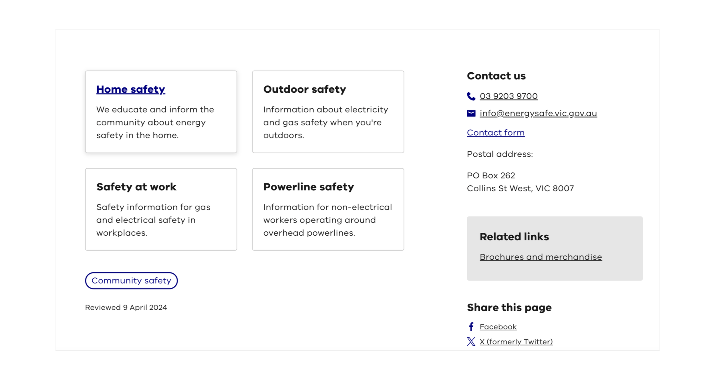
Energy Safe Victoria
Organises safety content by where you are: indoors, outdoors, at work. It matches how someone actually arrives at the site. Nobody searches "Part 3 gas installations"; they know they're in their kitchen. This became the model for our own restructure.
Structures topics around the questions consumers actually ask, rather than around the regulator's own categories. It also runs a persistent emergency banner with the number to call, so the most urgent action is never more than one glance away, regardless of which page you landed on.
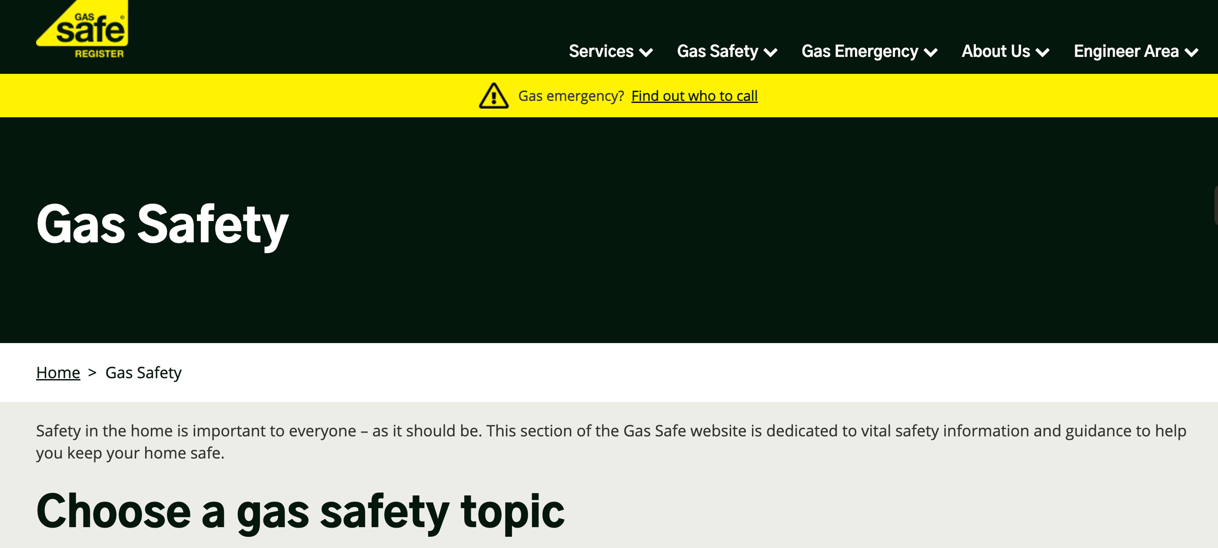
Gas Safe Register
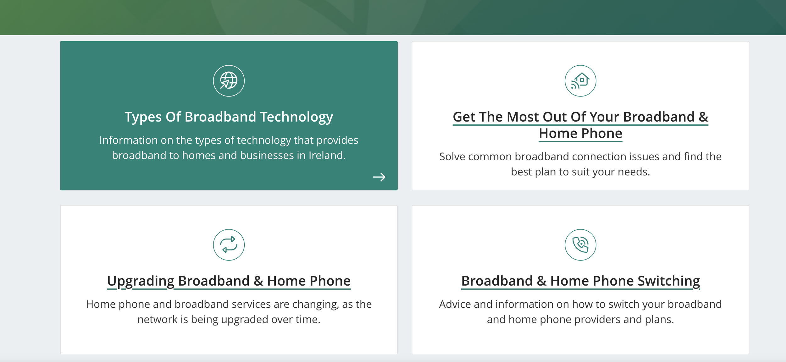
Comreg
Not a safety regulator, so we looked at it deliberately as a cross-sector reference: how does a regulator make itself useful to the public at all? The answer is clean information architecture, content divided by topic, a layout that stays out of the way, and tools rather than documents.
For whom are we actually designing this page ?
Life event
Someone in an Emergency
Smells gas or a CO alarm is sounding. Has no reading time at all and should not have to pick a section first.
Life event
The maintainer
Owns the appliance and the obligation. Needs servicing intervals and a way to verify the person turning up at the door.
Life event
The new mover
Just moved in, often renting. Doesn't know what to check, who is responsible, or what they're entitled to ask their landlord for.
How might we
help the Public understand a real safety risk and take one clear action on it, while making the CRU the place they trst ?
SOLUTION
Sort by problem, not by clause
People don't arrive researching gas safety. They arrive because they've just moved, something needs servicing, or something is wrong right now. Those three entry points resolve into three standing content areas.
Inside your home
Carbon monoxide, appliance servicing, what to do if you smell gas, electrical works.
Outdoors & around the network
Dial Before You Dig, overhead lines, working near gas mains, LPG cylinders and storage.
Seasonal & situational
Heating season, barbecues and patio heaters, moving into a rented home, storm aftermath.
Links with commitment issues
I drafted the calls to action for every page. The content stays educational; awareness is the point, but each page now closes on a specific thing to do, named in the user's terms.
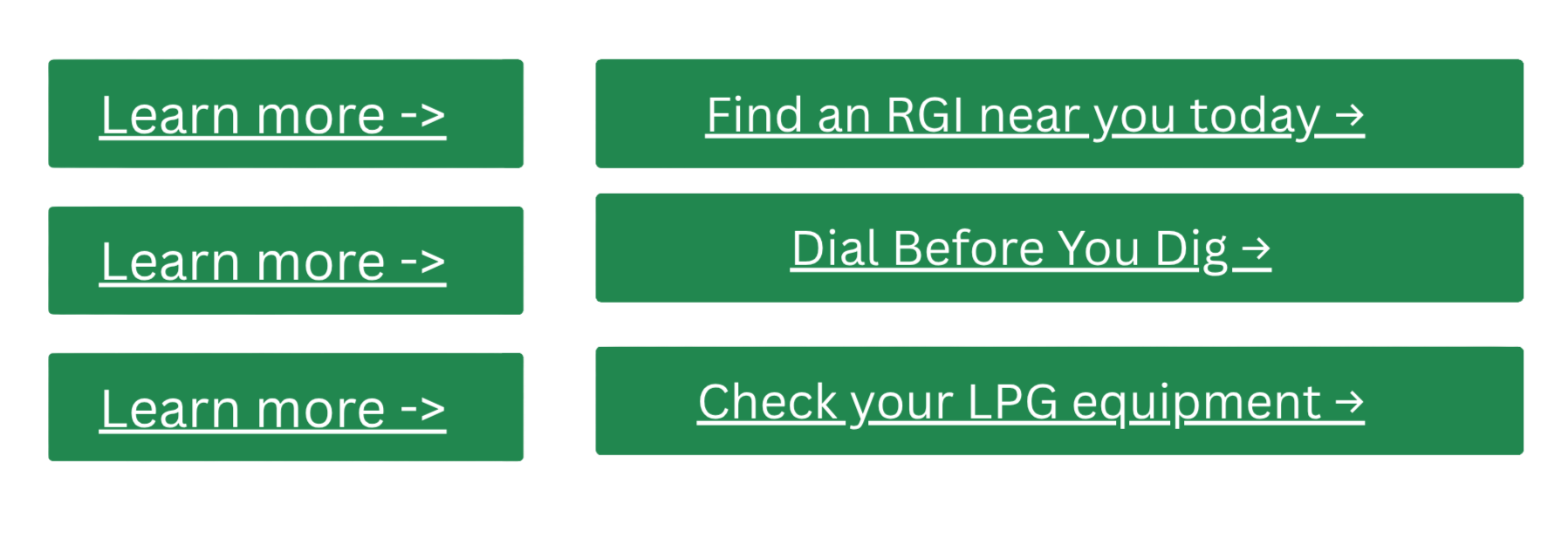
Before
After
Specificity beats completeness
Doing one useful thing today beats knowing everything about it.
1
Name of the Target User
Homeowner, renter, landlord, contractor. If advice doesn’t name who it’s for, people assume it’s for someone else.
2
Rights convert better than tips
If an RGI/REC is legally required for the repair, you can request it; advice is optional; entitlement is not.
3
BEFORE AND AFTER
Using Insights to develop a Solution : Wireframing the change
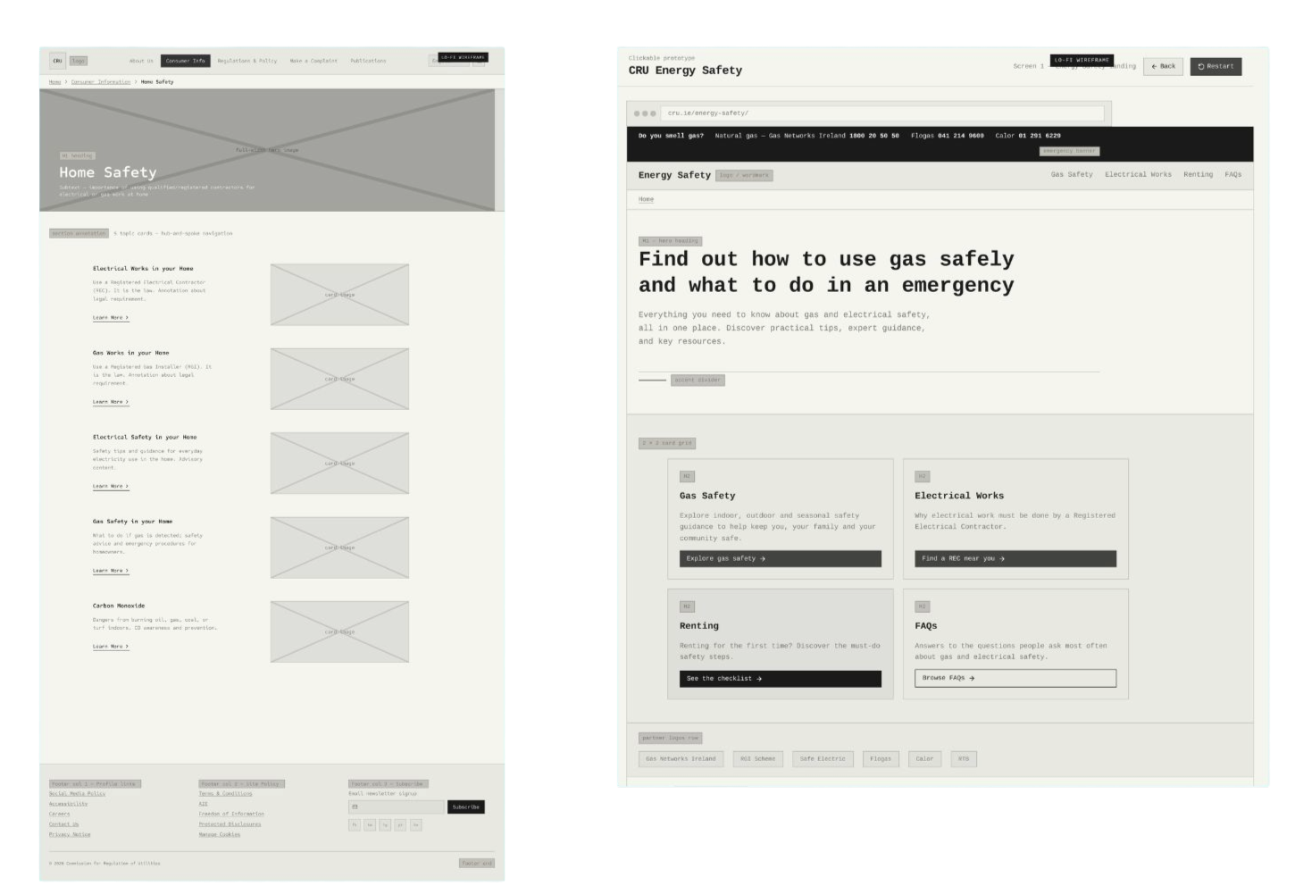
Before
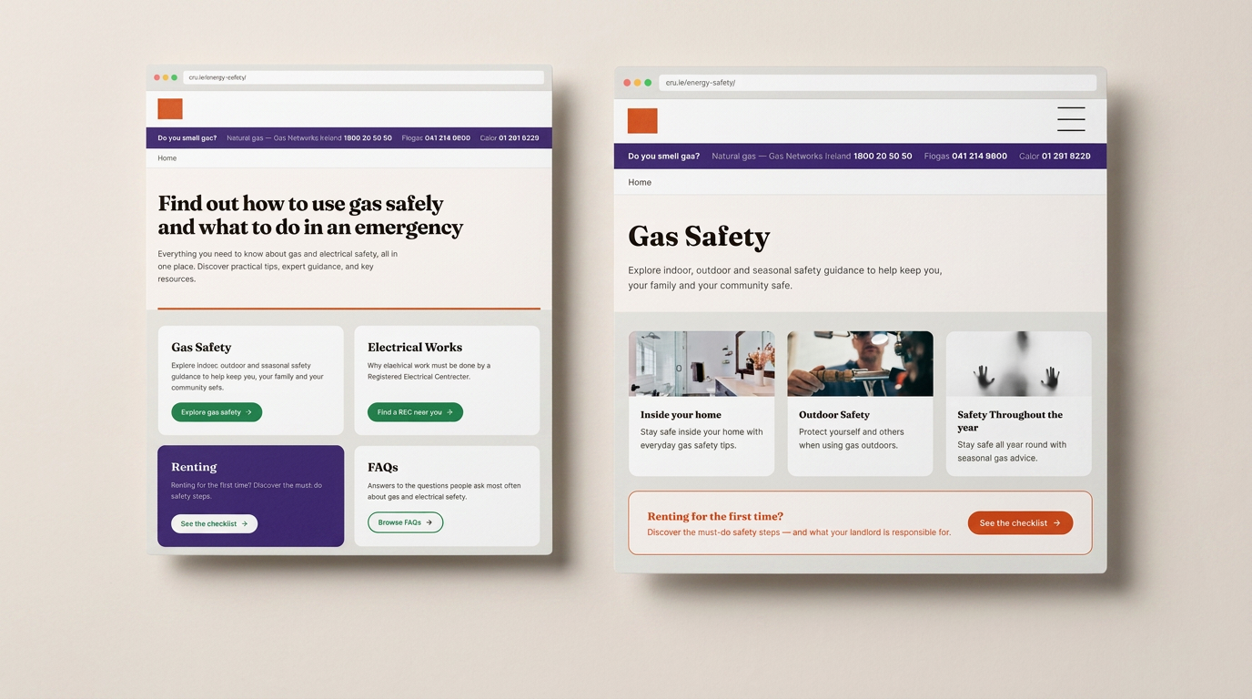
Five equal-weight cards, split by energy type and by works-versus-general tips, each ending in the same "Learn More".
Nothing is prioritised, nothing names a situation, and the emergency case sits four cards down inside "Gas safety in your home"
After
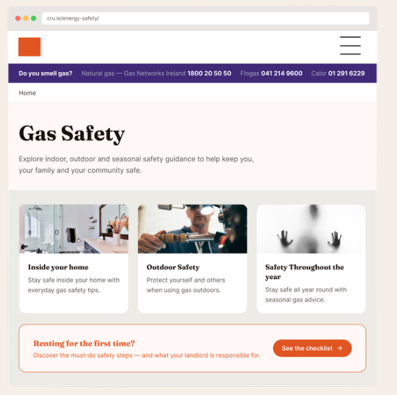
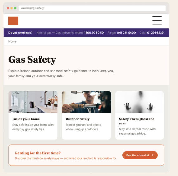
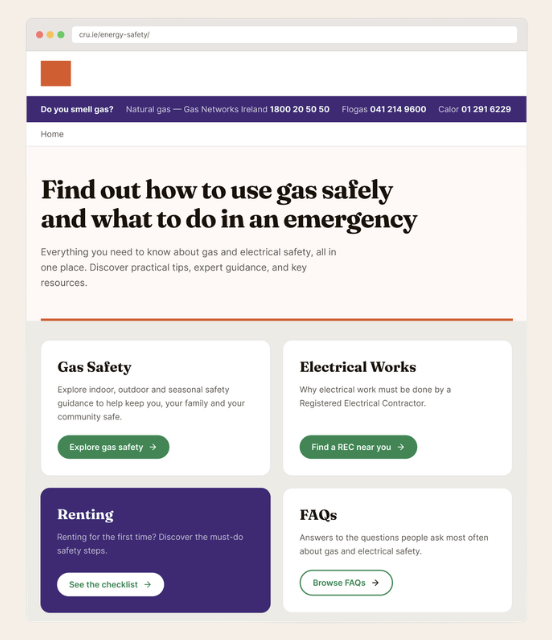
Emergency numbers pinned above everything, all three suppliers resolved in the component. Three situations replace five topics, each opening onto a drill-down where every card ends in its own named action, then explicit signposting out.
-
![Screenshot of a gas safety webpage from Gas Networks Ireland, featuring sections on inside home safety, outdoor safety, and yearly safety tips, with a banner highlighting gas smell detection and a call-to-action button for safety checklist.]()
A persistent emergency bar that resolves the fuel-type split itself
Someone who smells gas won't read a page. A persistent top bar, never scrolling away, shows emergency contacts for Natural Gas and LPG side by side, labelled by fuel, so a frightened person can immediately choose the right one.
-
![Screenshot of a website page titled 'Find out how to use gas safely and what to do in an emergency,' offering safety guidance, electrical work, rental info, and FAQs with green buttons for navigation.]()
Gas Safety
Three situations concisely cover several safety topics, each opening onto a drill-down where every card ends in its own named action, then explicit signposting out.
-
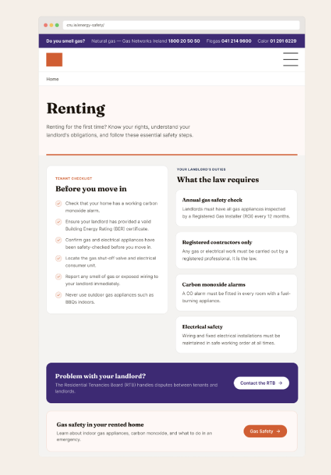
![Screenshot of a webpage titled 'Renting', with a section on a landlord's duties and safety tips for renting a home, including gas safety and legal requirements.]()
Renting
The checklist ends with tenant rights and the route to the RTB. Knowing that a check is your landlord's obligation is what turns intention into a request.
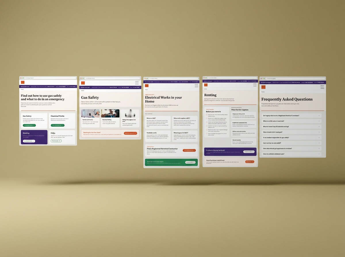
Screens that know what they want you to do
IMPACT
What changes inside and outside the organisation?
4 → 1
Open questions are visible
Questions that currently arrive by phone, email or through RGI and Safe Electric have a self-serve route.
LPG parity and the FAQ decision sit annotated on the artefact rather than in someone's inbox, so they're owned, not forgotten.
1.7m
Households in scope
Every home in Ireland with a fuel-burning appliance is a potential carbon monoxide case. That's the total addressable audience for this guidance, the ceiling the work is aimed at.
500k+
Rented Households.
For those tenants, the barrier to a safe appliance usually isn't knowledge; it's not knowing they're entitled to insist. Ending the renter checklist on tenant rights and the RTB is what turns reading into asking
REFLECTIONS
Three things this project taught me about designing for a regulator
01
Reframing the brief is the design work
The most valuable thing I did wasn't a screen. It was showing four teams, with their own data, that they had an action problem rather than a content problem, and getting them to agree before anything was drawn.
02
Being correct isn't the same as being useful
A regulator's authority comes from accuracy. Its reach comes from usability. The existing pages had the first and were losing the second, which meant the accuracy wasn't getting to anyone.
03
Unresolved questions belong on the artefact
I sent the screens for review with my notes on LPG parity and whether FAQs are needed. Flagging a question now is cheaper than finding it during build, and it shows the team what needs a decision-maker, not a designer.